

Young Hotels Rebrand
After creating the flamingo logo for The Illinois Hotel, I was selected to develop a unified visual direction for all venues within the Young Hotels group. Although each hotel had its own unique character and clientele, owner Bill Young wanted them to share subtle visual connections under one brand family.
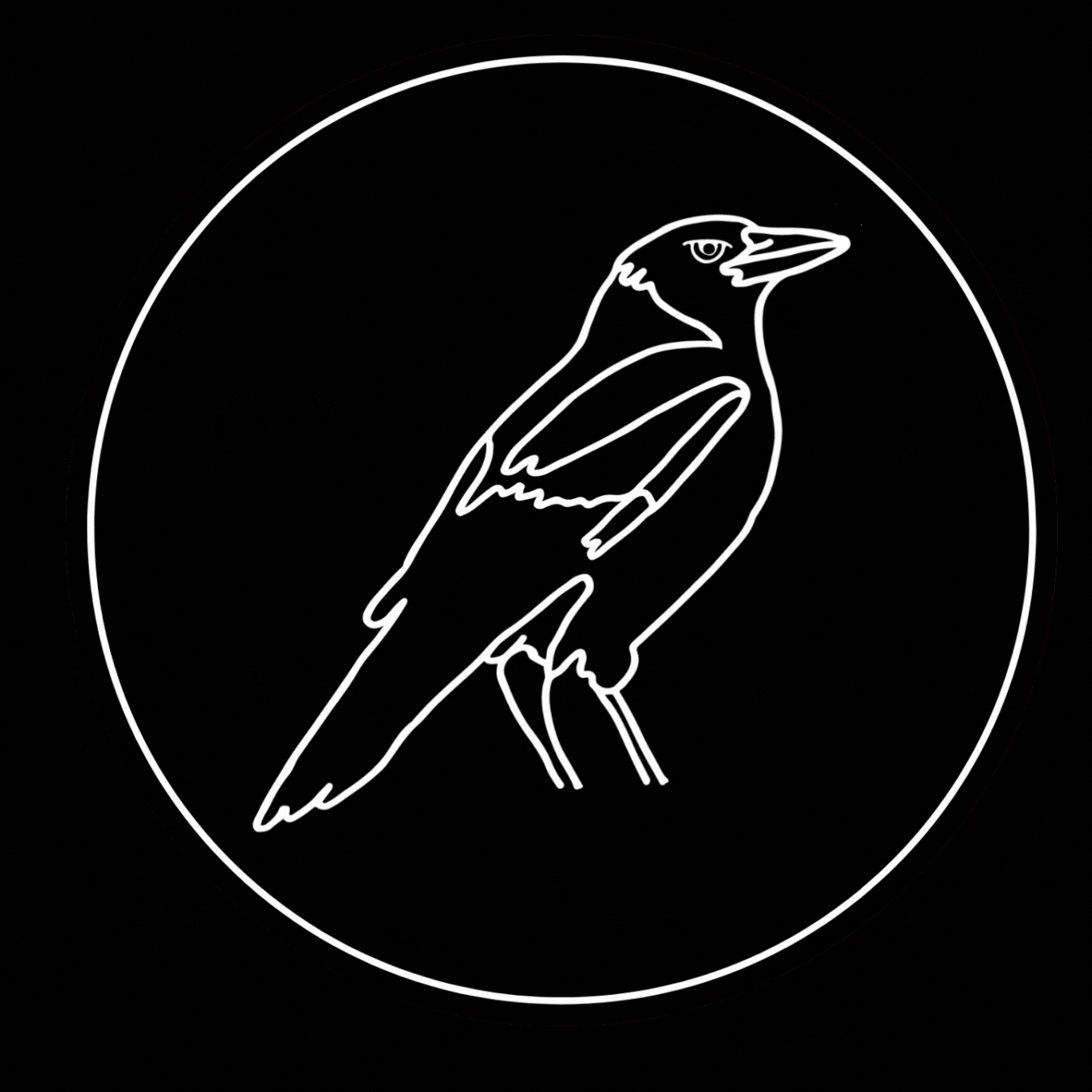
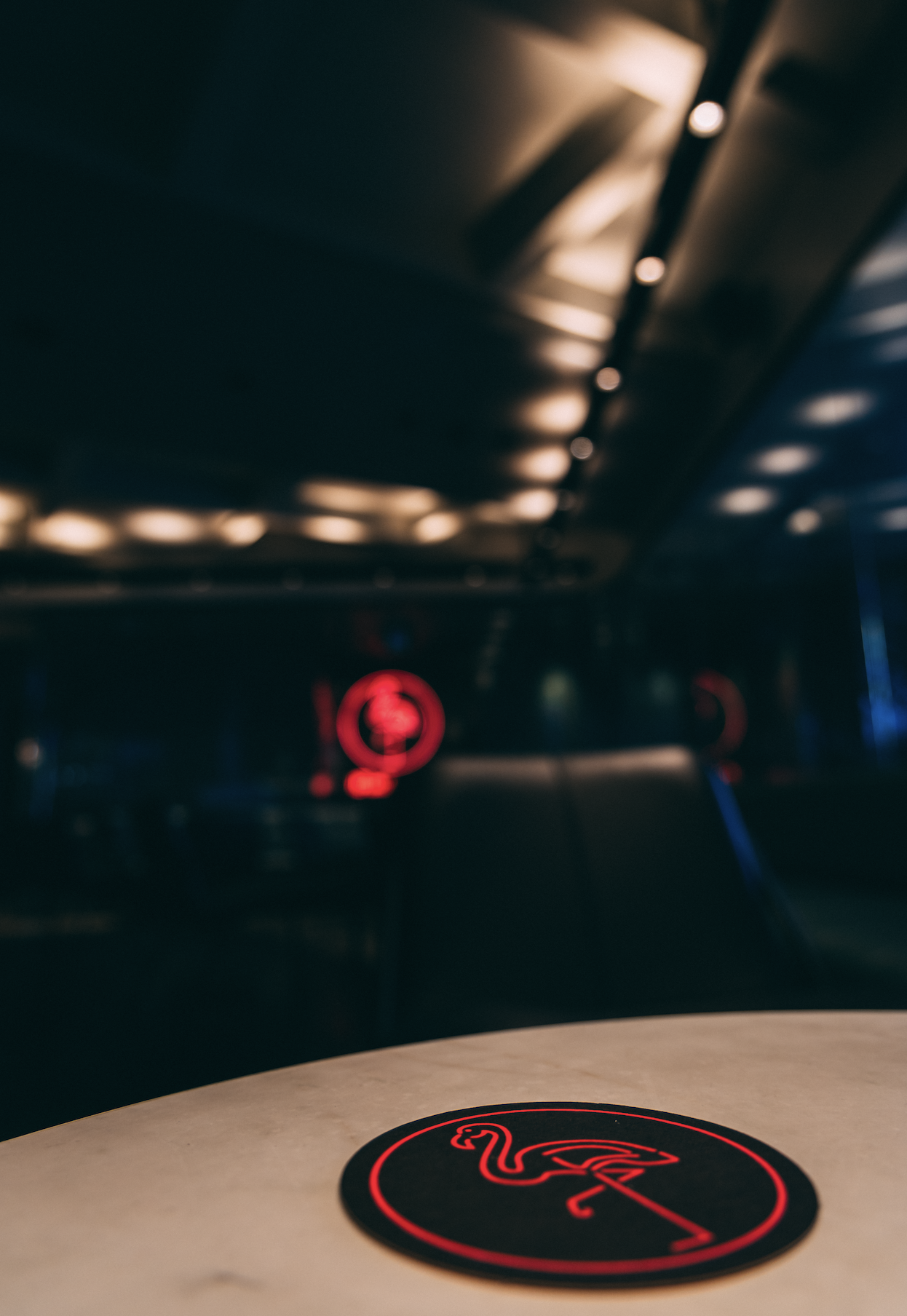
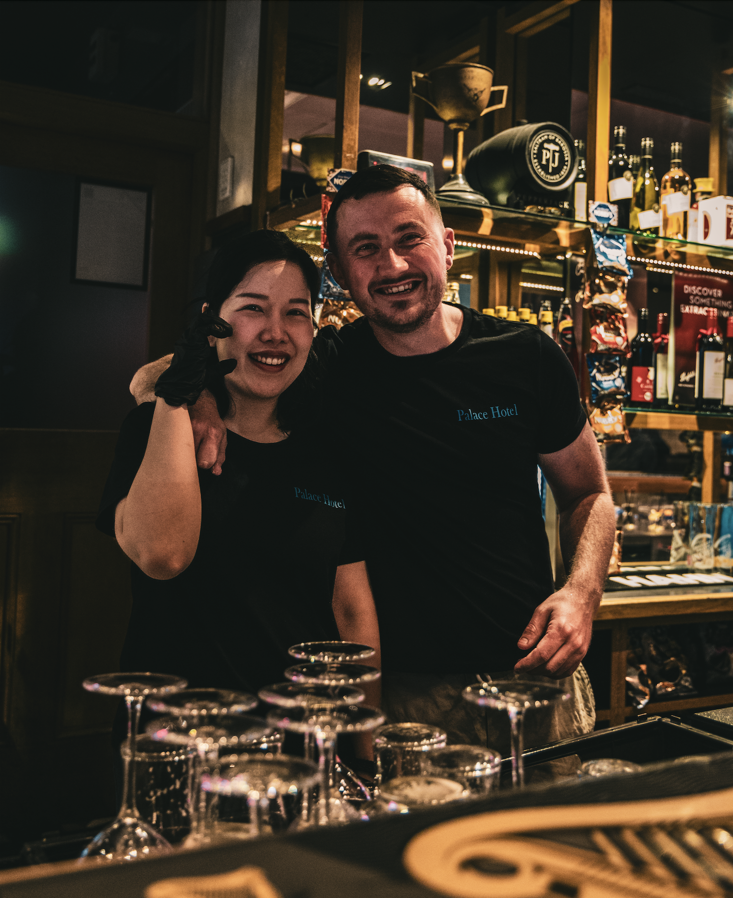
The brief was to design a logo for each hotel featuring a bird, each chosen for its personal or local significance. The Palace Hotel features a bluebird, a tribute to Bill’s late father’s favourite bird and one often seen around the area of Mortlake. The Concord Hotel carries a magpie, representing the Inner West community. The Five Dock Hotel is symbolised by the sparrow, a nod to the area’s Italian heritage. The Friend in Hand Hotel features a cockatoo, inspired by the venue’s resident bird, Georgie. The Wisemans Inn Hotel showcases ducks, referencing its riverside setting, and the Royal Hotel bears a hawk, representing both its regal character and the local West Ryde Hawks sporting team.
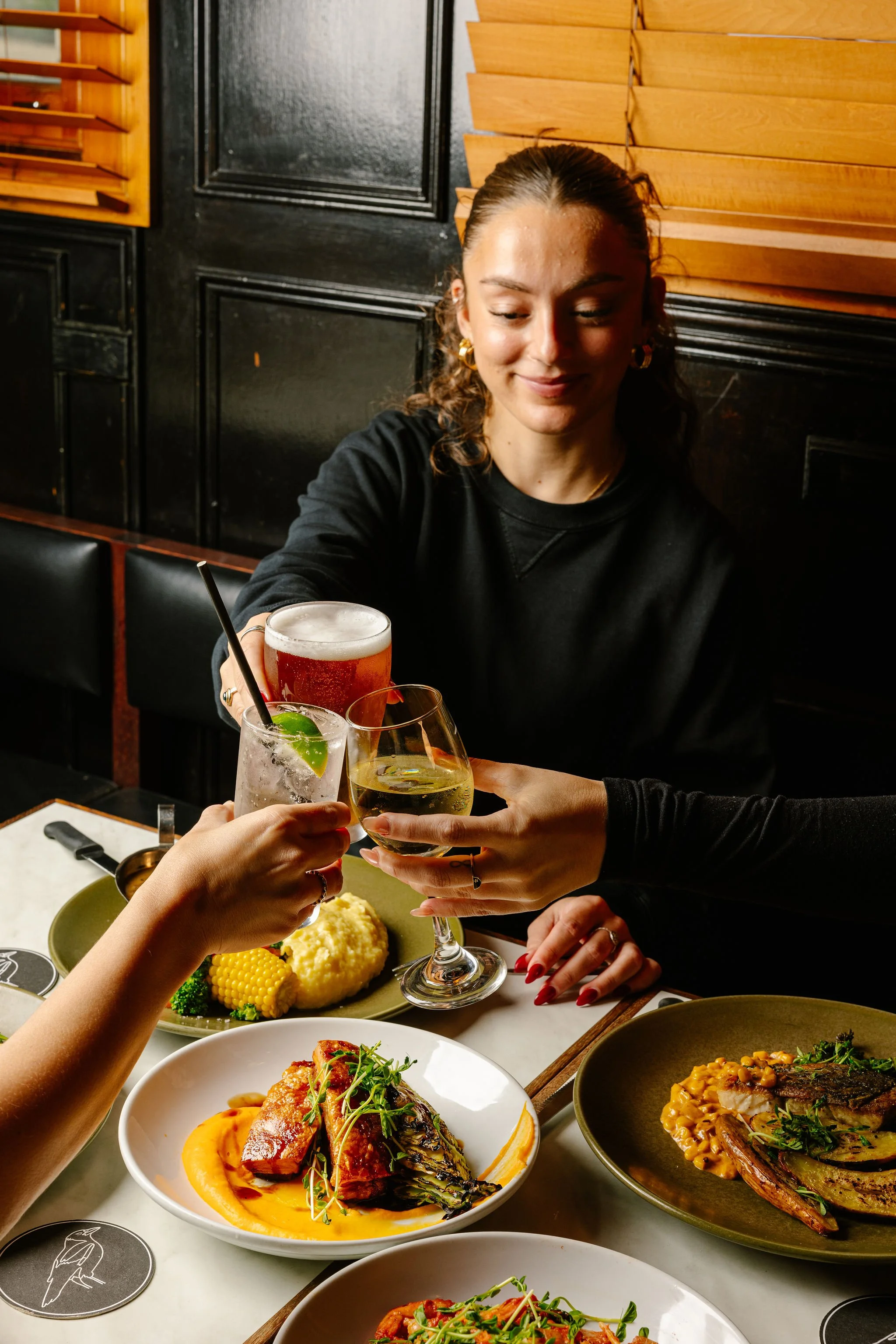
Each logo was designed to stand alone while still feeling part of the wider Young Hotels brand identity. Alongside the logo suite, I designed new uniforms, coasters, lighters, venue vouchers and supporting collateral to complete the rebrand. I also created logos for Baroola Wines, Baroola Meats, and the Young Hotels brand itself, ensuring a consistent, modern aesthetic across the full business group.


Hotel uniforms, Reel created for Social media


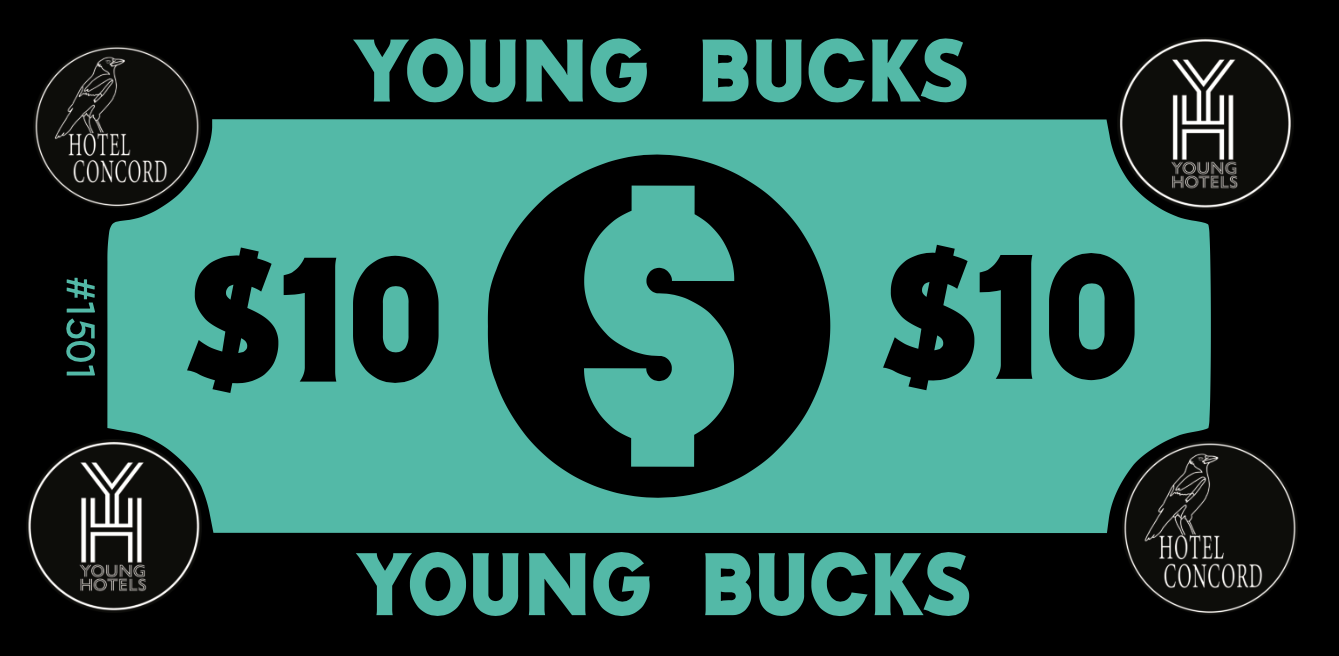
Young Bucks – Venue Voucher Design
The brief was to create venue vouchers for all Young Hotels venues, small-denomination rewards to be given out as prizes for events such as trivia nights and “Beat the Boss” competitions.
I developed the concept of “Young Bucks”, a playful yet on-brand name that tied back to the Young Hotels identity. The vouchers were designed in $10 denominations, slightly smaller than a standard note for easy handling and recognition.
To streamline processes across the group, each Young Buck voucher was individually numbered for tracking, and every venue’s POS system was updated with a dedicated “Young Bucks” button, allowing redemptions to be recorded consistently. The vouchers were printed double sided in perforated booklets, making it easy for staff to issue and reconcile them while maintaining clear administrative records.
The result was a unified and efficient rewards system that brought consistency, accountability, and a touch of personality to promotions across all Young Hotels venues. Vouchers must be stamped with unique stamp for validation.


Baroola Wines
“The Caitlin” & “The Jimmy”
Owner Bill Young wanted to create a wine brand that felt personal, something that connected his family’s story to the local community. As part of the creative team, I helped develop the concept for Baroola Wines, built around two signature wines named after his children: The Caitlin and The Jimmy.
Each wine reflected the personality and character of its namesake, The Caitlin, a Shiraz, bold yet refined, and The Jimmy, a Sauvignon Blanc, bright and lively. Even the tasting notes were written to capture their individual traits, creating a heartfelt narrative behind each bottle.
The wines were introduced as the house wines across all Young Hotels venues, giving patrons a personal connection to the brand and reinforcing the sense of community that defines Young Hotels.


Baroola Wines – Father’s Day Sales Campaign
The brief was to increase Baroola Wines sales across Young Hotels venues. To achieve this, I developed a Father’s Day campaign designed to engage patrons and create excitement around the brand.
I purchased a BBQ smoker from our BDF to use as the main prize, which was displayed in-venue to attract attention and encourage participation. For every glass or bottle of Baroola Wine purchased, customers received an entry into the draw to win the smoker.
The campaign successfully boosted wine sales during the promotional period and strengthened customer recognition of Baroola Wines as the group’s own signature label.

Venue posters

Social media post

Baroola Meats – From Paddock to Plate
The brief was to create a brand story and visual identity that connected the Young family’s farm to their hotel venues, bringing the concept of “from our farm to our restaurants” to life.
The Bill Young Family Farm “Baroola” supplies premium beef directly to the Young Hotels group, embodying a true paddock to plate philosophy. The farm’s bulls are highly accredited and purchased from top-ranking Wagyu studs, with a working life of around seven years. The female herd is sourced from leading Angus studs, producing a first-cross Wagyu/Angus breed that combines Wagyu’s rich marbling with the distinct flavour of grass-fed Angus.
I created the Baroola Meats logo and visual identity, ensuring the brand reflected both premium quality and authentic Australian origins. The logo was applied across multiple touchpoints, including cutlery pouches and custom-designed paper placemats, which were paired with Baroola Wines to reinforce the connection between the farm and the in-venue dining experience.


